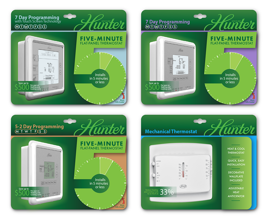
Designed packaging for full line of thermostats. Predominately used Hunter’s greens, but accented with eye-catching colors to help the user distinguish between the different programming technologies across the models. The large “5” highlights the easy installation feature, but also functions as a die cut flap which can be easily gripped to pull back and reveal more product information on the inside.
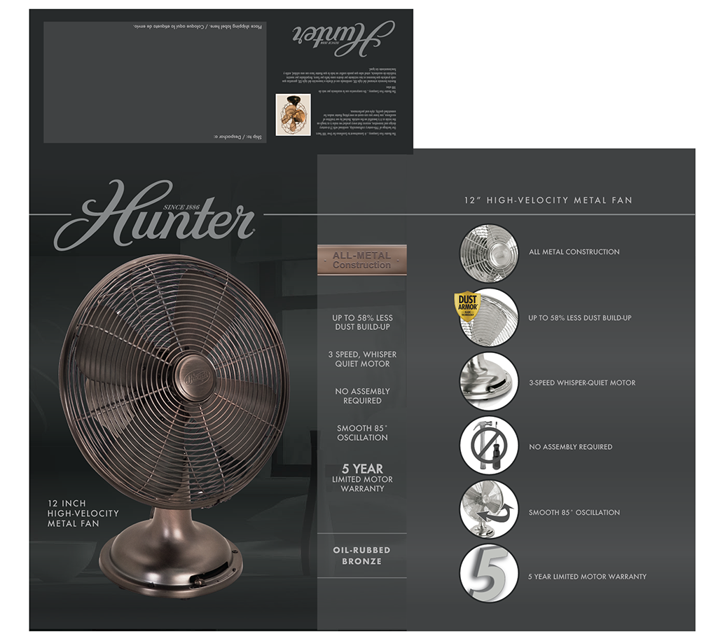
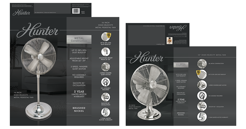
This line of dark and moody portable fan packaging was developed for a test run in Target stores. This luxury lifestyle aesthetic proved to be highly successful, so after the initial run they ordered a million units of both table top models to roll out nationally.
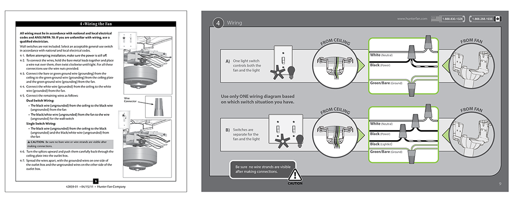
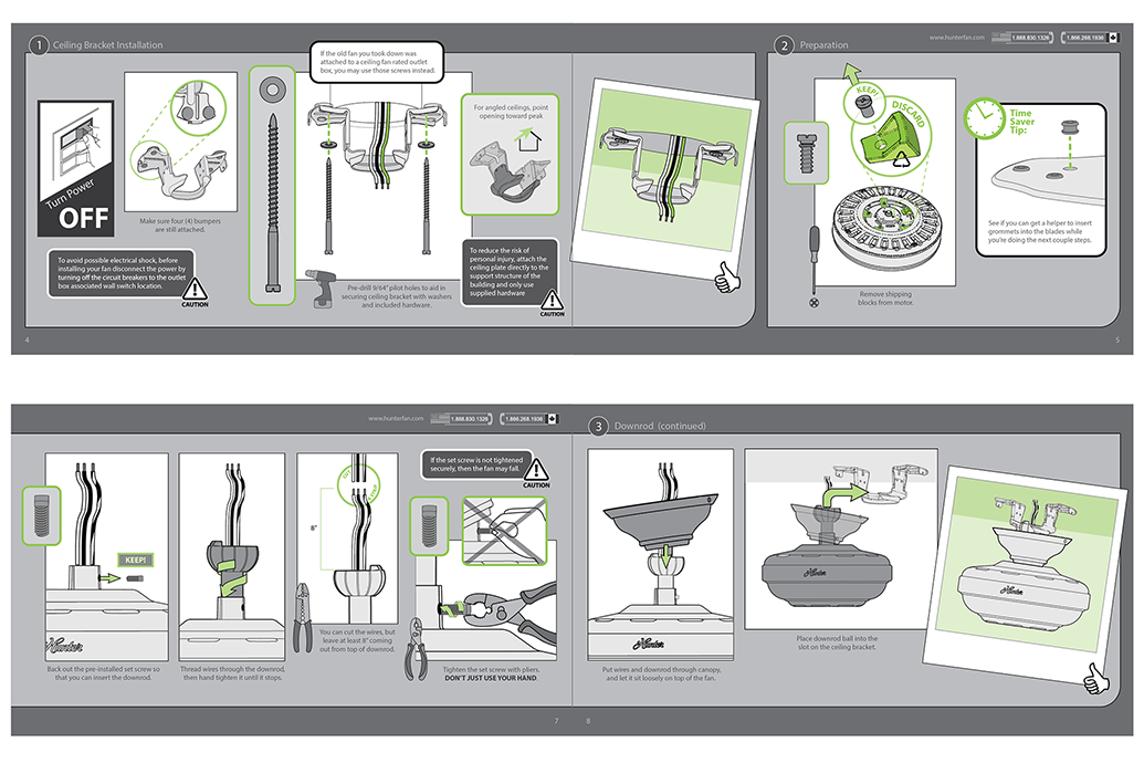
I headed up a cross functional committee comprised of team members from engineering, marketing, product design, and graphic design to establish a new company wide manual design standard. The old manual design (pictured top left) was very word heavy with small and complex pictures. We conducted extensive user experience research using think aloud protocols and found that minimal wording with maximum imagery was most effective in making the installation process easiest on the user. (Samples from the new manual style in grey aren’t in chronological order.)
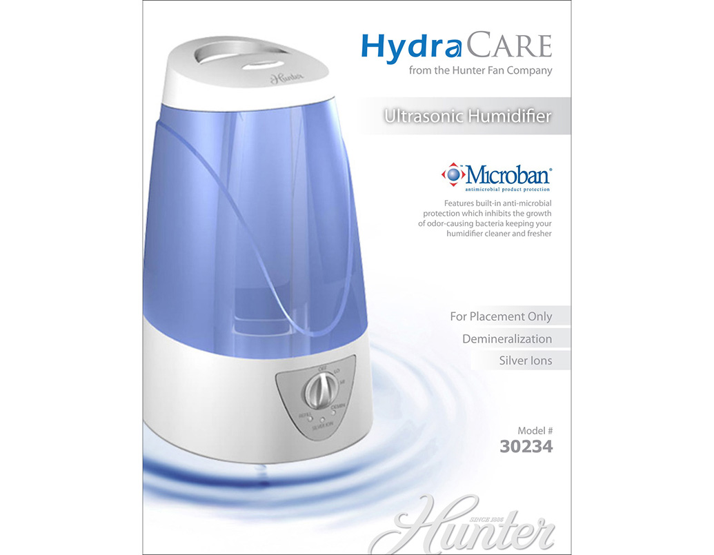
Packaging concept for proposed humidifer sub brand. White and water ripples are utilized for a pure, spa-like aesthetic. Logo concept was developed by me as well.
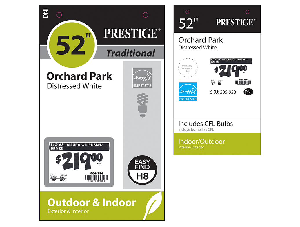
The hang tags for the display fans at Home Depot were in need of a redesign. There was no clear hierarchy of information. On the refreshed design the price and fan size were made most prominent because these are the key concerns of the customer. The remaining information has been sorted and spaced in a more organized way.
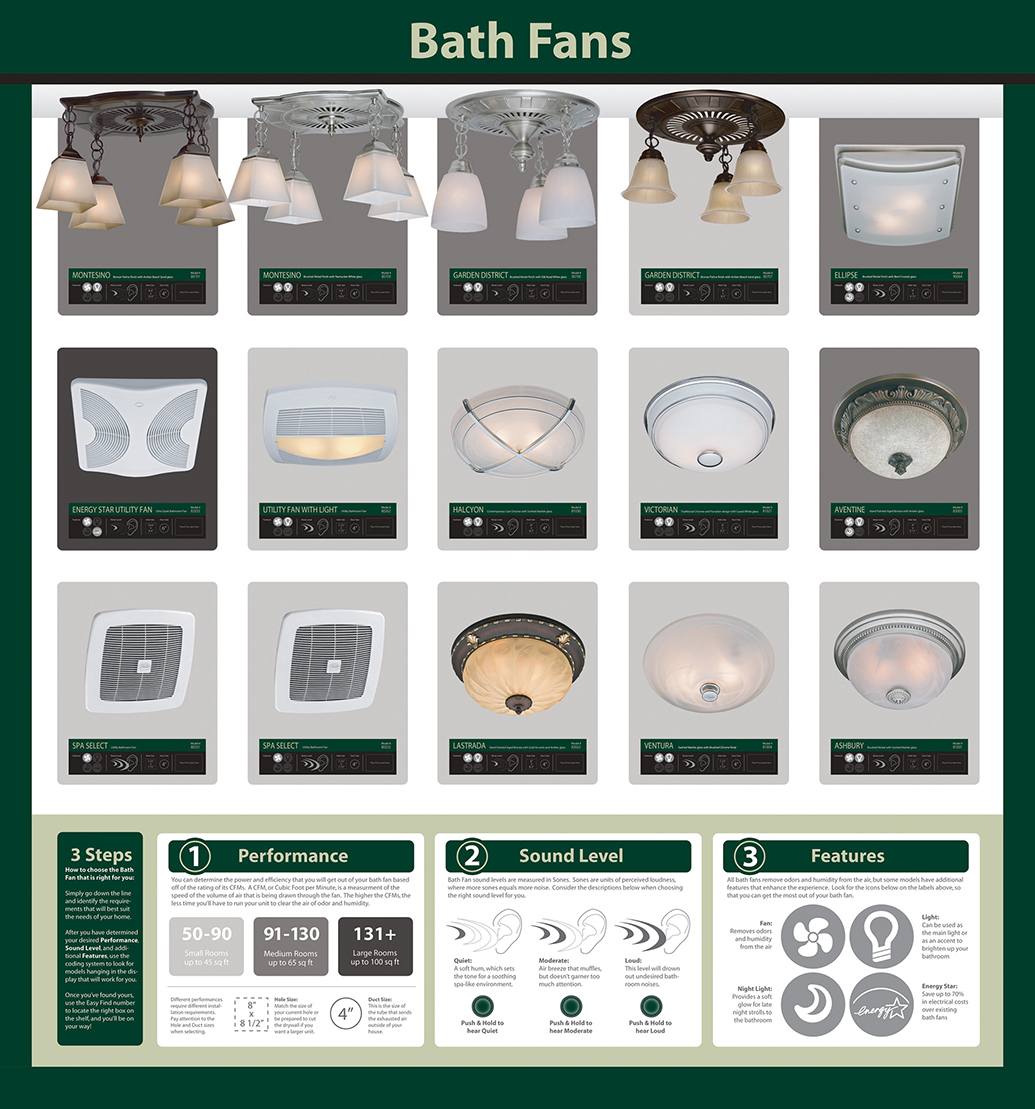
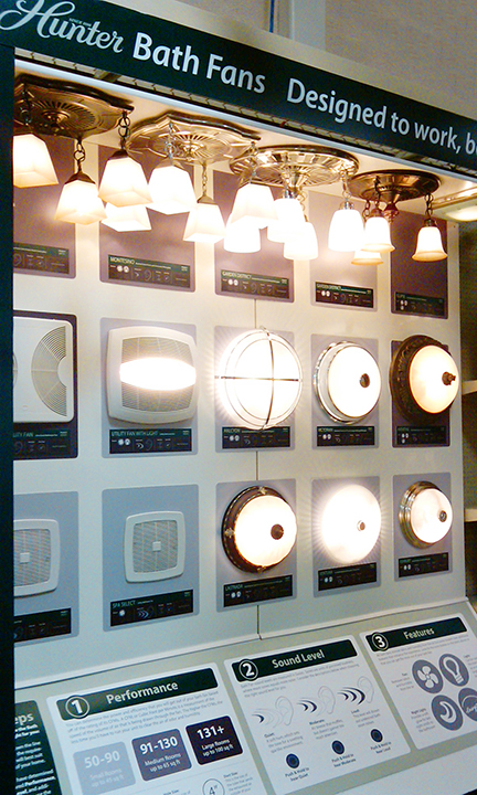
Bath fan options are surprisingly complicated and confusing for a user to understand at point of purchase in store. Menards asked us to redesign their 10′ x 10′ display to simplify the decision making process for the customer. We broke it down into a 3-step process clarifying performance, sound, and feature options. This labeling system dramatically improved ease of use when rolled out in their stores.